
Overview
Company
Global Garner
My role
UI/UX Designer
Platform
Landing Page
The landing page is designed for retailers and shop owners who are looking for digital tools and financial services to support and grow their businesses. It aims to clearly present the platform’s offerings and help business owners understand how POS and financial solutions can simplify transactions, manage earnings, and improve daily operations.
The page also targets individuals who are exploring modern POS and financial service platforms for managing payments and business activities. In addition, it helps potential partners evaluate UPOS as a platform for distributing services, expanding their reach, and creating new business opportunities.
The original landing page lacked clarity, structure, and a strong conversion focus. Important information was scattered across the page, the visual hierarchy was weak, and primary calls to action were not clearly highlighted. As a result, users found it difficult to quickly understand what UPOS offers and why they should sign up.
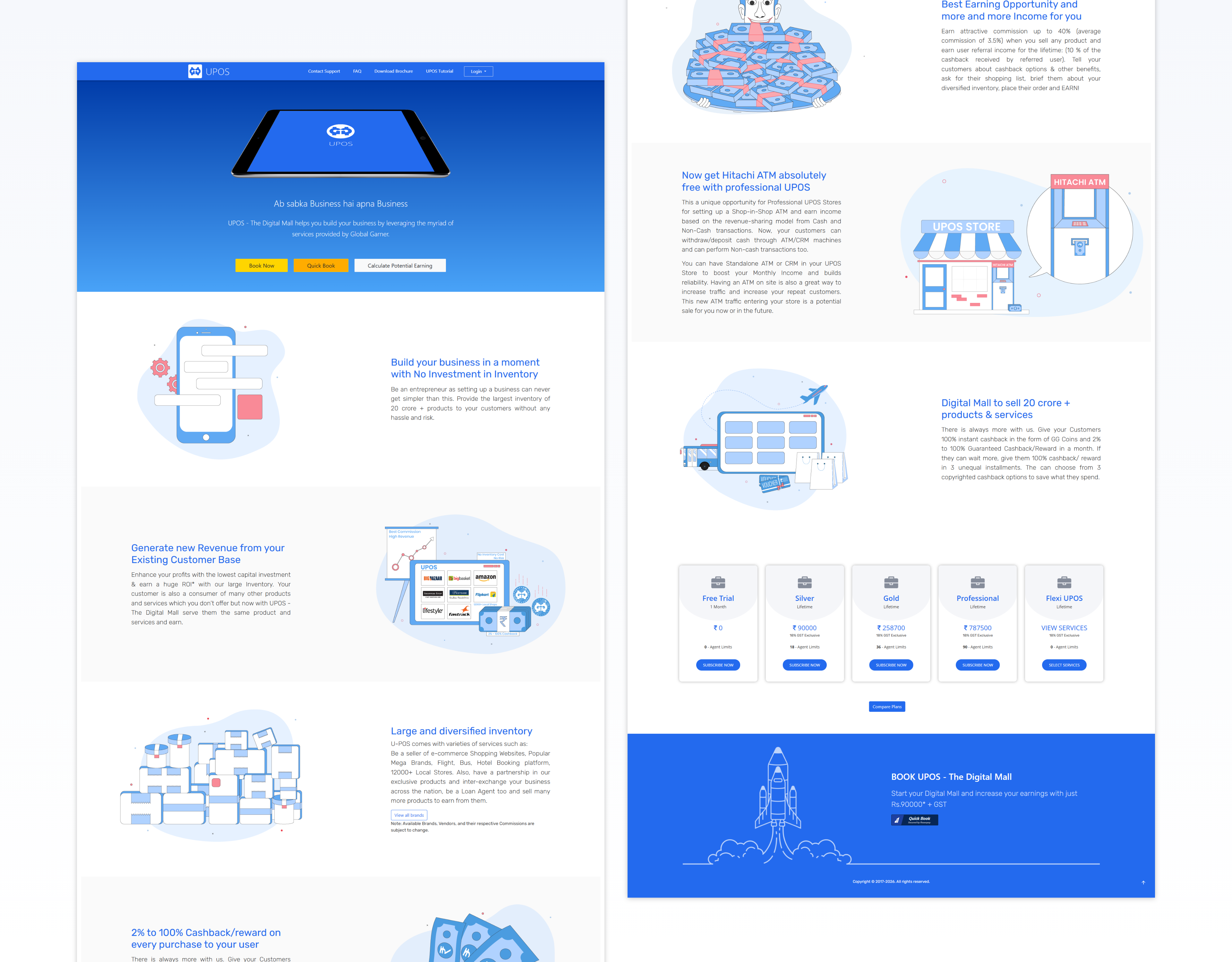
From a UX perspective, one of the main challenges was improving the visual hierarchy so users could easily understand the most important information first. The existing content needed to be reorganized in a way that clearly guided user attention and simplified complex service offerings into well-structured, easy-to-digest sections.
Another challenge was making primary calls to action more visible and action-driven so users would be encouraged to take the next step. It was also important to reduce cognitive load by minimizing dense text and grouping related information logically, allowing visitors to scan the page quickly and understand the platform’s value more effectively.
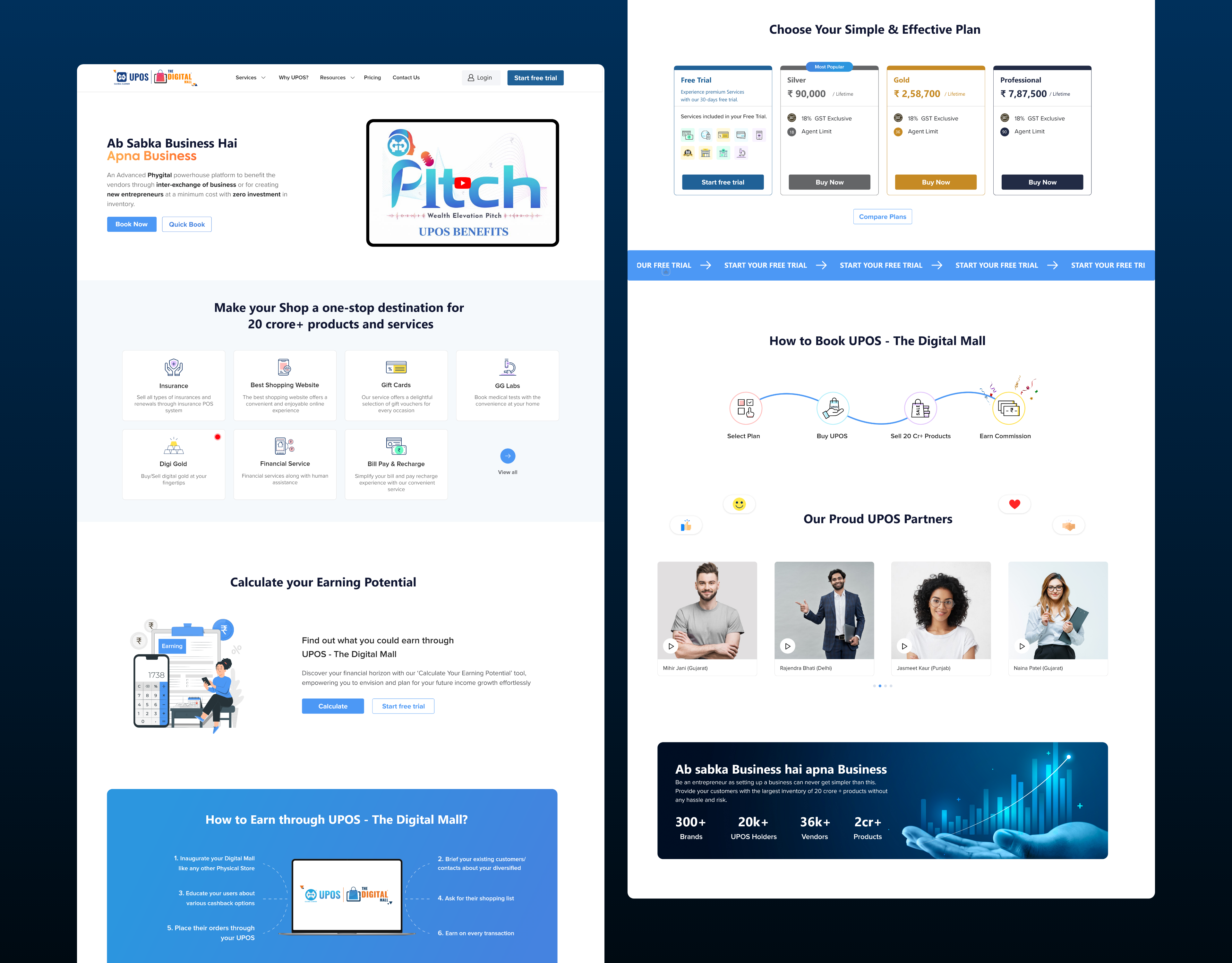
The goal was to transform the outdated layout into a clean and modern SaaS-style landing page that better reflects the platform’s capabilities and professionalism. The design focused on clearly communicating UPOS’s benefits and earning potential so users could quickly understand the value of the platform.
In addition, the content structure was improved to make information easier to scan and navigate. Primary and secondary calls to action were strengthened to encourage user engagement and increase conversions, while credibility was reinforced through a more structured layout, stronger visuals, and trust indicators that help build confidence in the platform.
The solution focused on reducing complexity and creating a more intuitive experience for visitors exploring the platform. A strong hero section was introduced with a clear headline, supporting description, and a prominent primary call to action to immediately communicate the platform’s value. The overall content was reorganized into logical sections such as Benefits, Earning Model, Features, Plans, and Trust Indicators to guide users through the information in a structured way.
To improve readability, text-heavy areas were simplified and spacing was optimized so users could easily scan the page. A clear pricing section was also designed to allow easy comparison between plans. In addition, calls to action were strategically placed throughout the page to guide users toward trial and signup, while consistent typography, spacing, and illustration styles helped create a clean and modern SaaS-style experience.
 1.svg)