
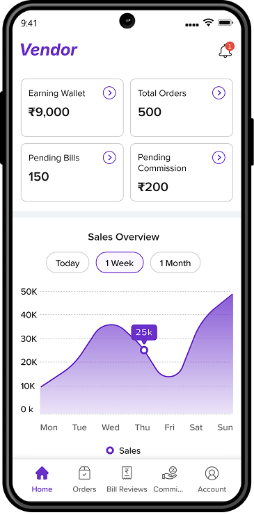
Overview
Company
Global Garner
My role
UI/UX Designer
Platform
Dashboard
The application is designed to help vendors manage their daily operations more efficiently, providing a simple way to track orders, generate and manage bills, and monitor daily earnings without unnecessary complexity. The goal is to streamline routine tasks so vendors can focus more on running their business rather than handling complicated systems.
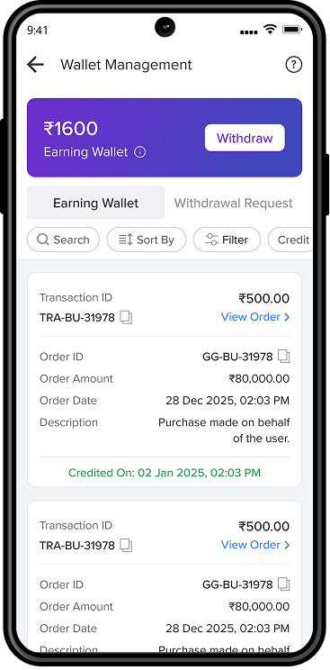
At the same time, the platform supports operations and finance teams by offering clear visibility into order progress, approvals, and fulfillment processes. Finance users can easily monitor commissions, wallet balances, and transaction history, ensuring accurate financial tracking and better operational transparency..
The existing system had several usability and clarity challenges that made everyday tasks harder for users. Important information was buried within dense layouts, making it difficult to quickly identify key details. Financial data such as bills, commissions, and wallet balances lacked a clear structure, forcing users to spend extra time interpreting the information.
In addition, critical actions like Approve, Dispatch, and Withdraw were not clearly highlighted, which slowed down task completion. Many frequently used actions also required unnecessary steps, increasing effort during daily workflows. As a result, users struggled to easily understand order progress and payment status, reducing overall confidence and clarity when using the system.
From a UX perspective, one of the main challenges was structuring financial data in a way that allowed users to quickly understand important values without having to read through dense information. Order and payment states also needed clear and consistent indicators so users could instantly recognize progress and identify the actions required.
Another challenge was ensuring consistency across multiple modules by using unified layouts and interaction patterns to create a predictable and seamless user experience. The goal was to present detailed information while still maintaining visual clarity through proper hierarchy and progressive disclosure.
To address the identified problems, the design focused on simplifying complex workflows and making tasks easier for vendors to complete. Processes were broken down into clear, logical steps so users could perform actions quickly and confidently. A structured layout with proper spacing and clear typography was introduced to ensure that important information is easy to identify and understand.
In addition, common actions were streamlined by removing unnecessary steps and optimizing task flows for efficiency. Primary actions were visually prioritized to help users take the right action without hesitation. Clear visibility into order statuses and financial data was also provided, helping users better understand the system while building trust and reducing confusion.
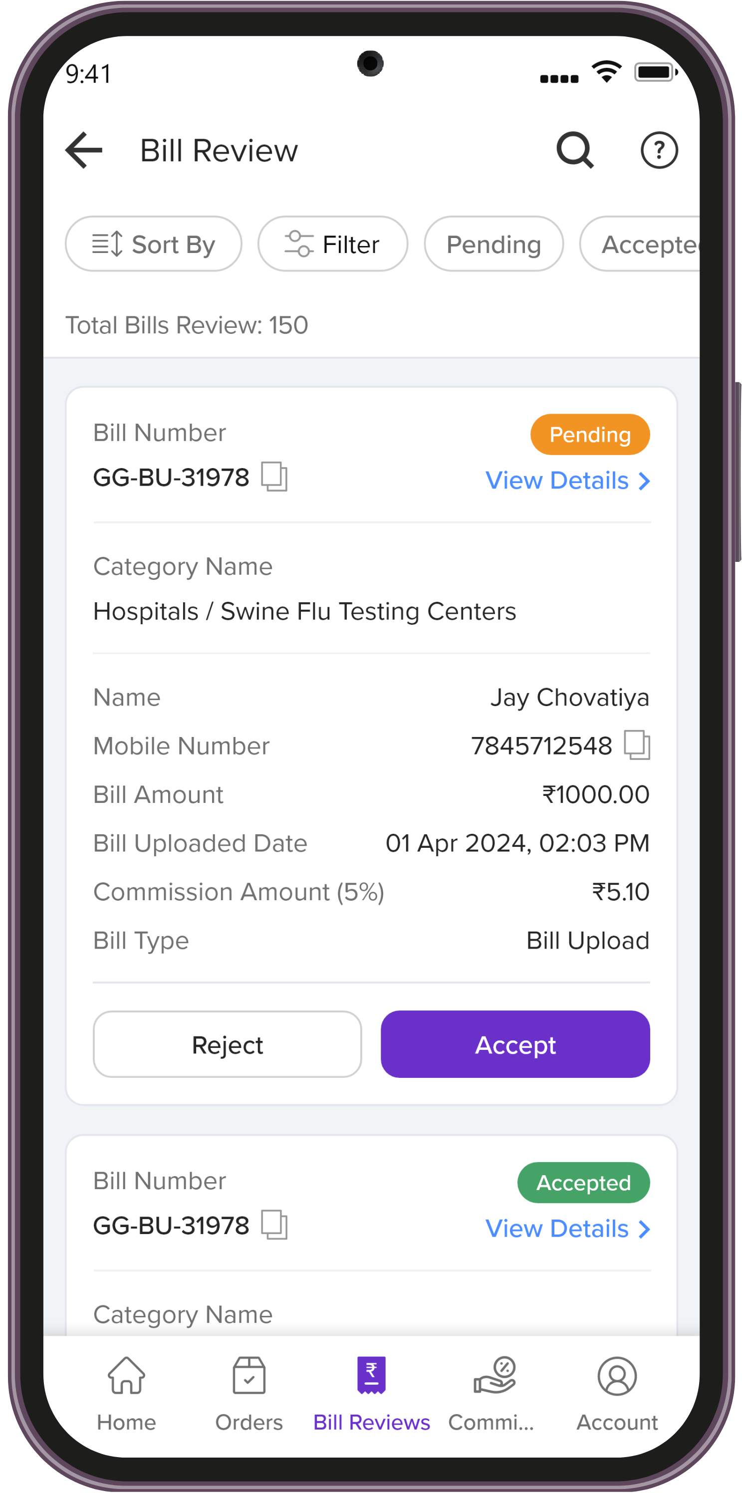
The solution focused on reducing complexity and creating a more intuitive experience for vendors. A card-based layout was introduced to clearly separate and organize information, improving readability and making important details easier to scan. Consistent color coding was also used for different statuses so users could instantly recognize order and payment states without needing to read detailed text.
To maintain a cohesive interface, typography, spacing, and button styles were standardized across the application. Primary actions were visually highlighted to help users complete tasks more efficiently and with less hesitation. Navigation was also improved across key sections, allowing users to move smoothly between Orders, Bills, Wallet, and Account areas.
AI algorithms analyze preferences to
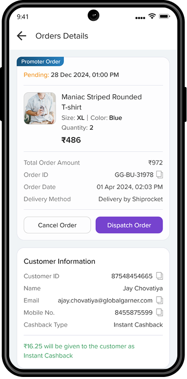
View detailed order insights.
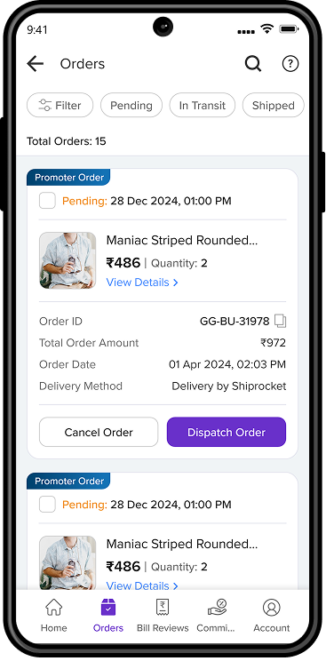
View order info, status, and actions.
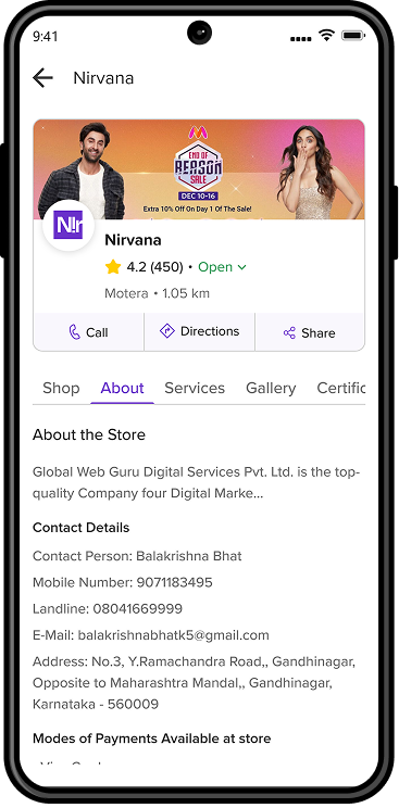
View store information, services, and other details.
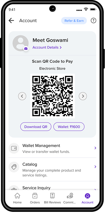
Profile details, QR payments, and wallet.
Review, accept, or reject submitted bills.
Track earnings, transactions, and withdrawals.
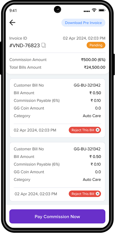
View, pay, and download commission invoices.
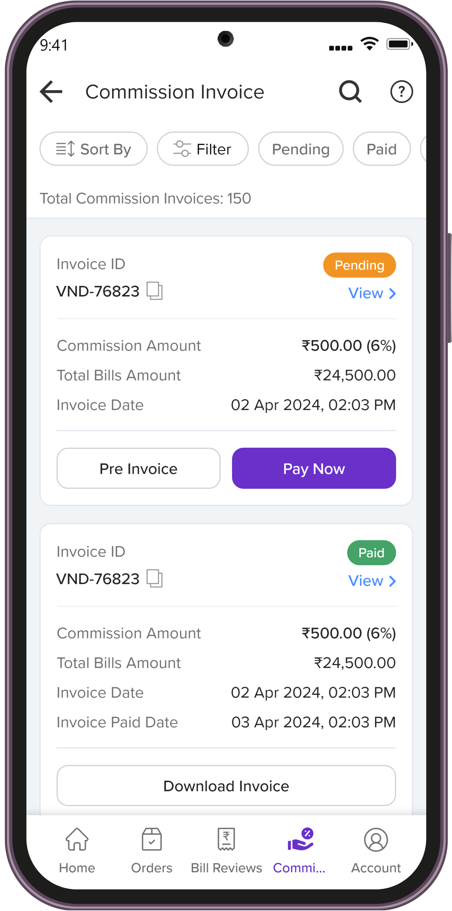
View invoice details and pay commission.
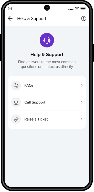
FAQs, calls, and support tickets.
 1.svg)