
Overview
Company
Global Garner
My role
UI/UX Designer
Platform
Dashboard
The platform is designed for vendors and store owners who manage daily operations like orders, billing, customers, and earnings, requiring a centralized system that simplifies workflows and reduces dependency on multiple tools.
It also supports operations and finance teams who need clear visibility into transactions, commissions, and performance data to ensure accurate tracking, better decision-making, and smooth business operations.
The previous dashboard lacked a clear visual hierarchy and structured layout, making it difficult for users to quickly scan important data and understand what actions to take. This resulted in confusion and slower task completion.
Additionally, cluttered interfaces and inconsistent navigation increased cognitive load, forcing users to spend more time searching for information and reducing overall operational efficiency.
One of the main challenges was organizing multiple complex modules such as orders, billing, wallet, and customers into a single cohesive system without overwhelming the user with excessive information.
Another challenge was balancing high data density with clarity, ensuring that users could access detailed information while maintaining readability and quick actionability.
The goal was to design a modern, intuitive dashboard that simplifies complex workflows and provides a seamless experience, allowing users to focus more on their business tasks rather than understanding the interface.
It also aimed to improve efficiency by highlighting key metrics, simplifying navigation, and making critical actions easily accessible within fewer steps.
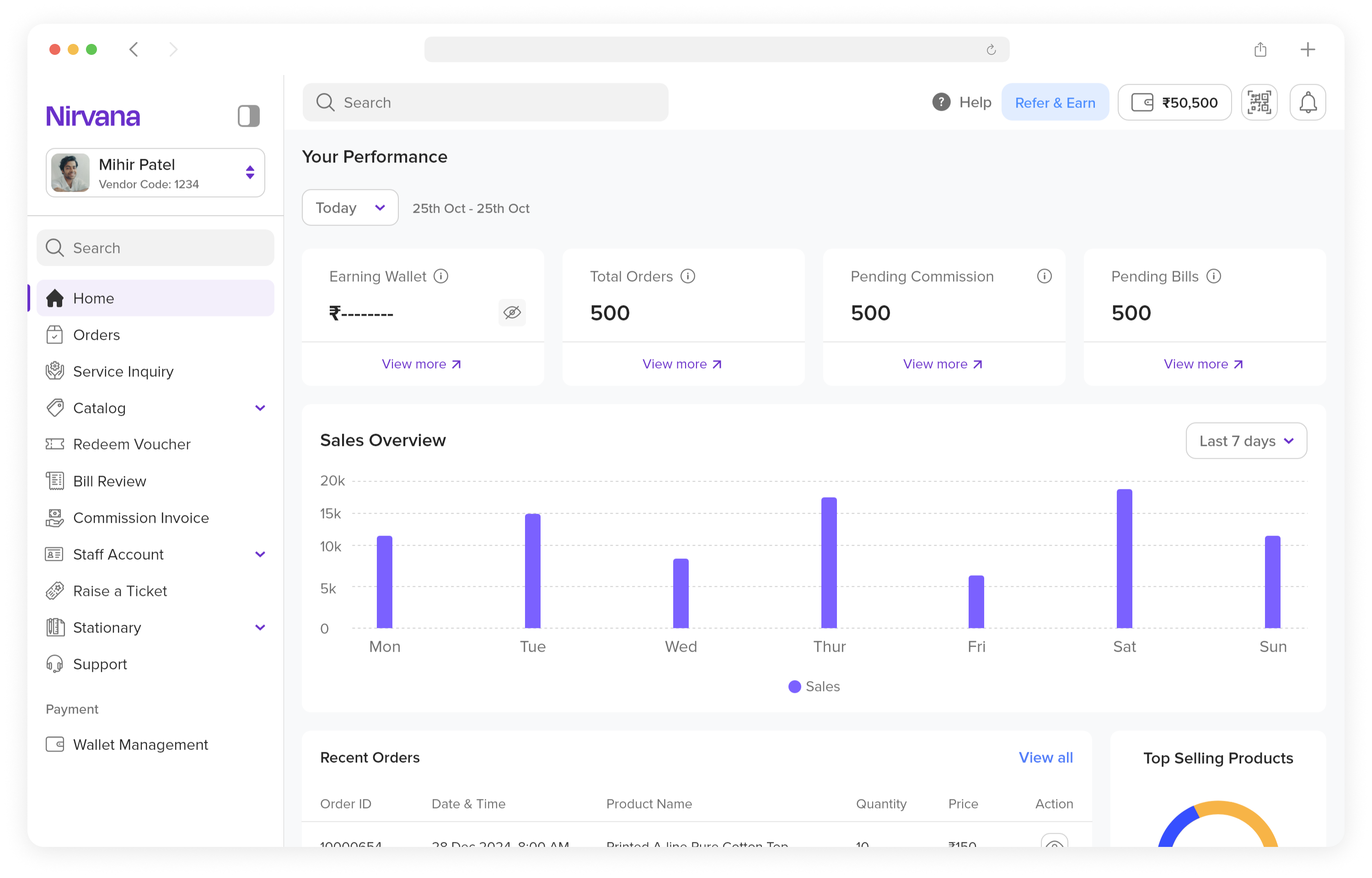
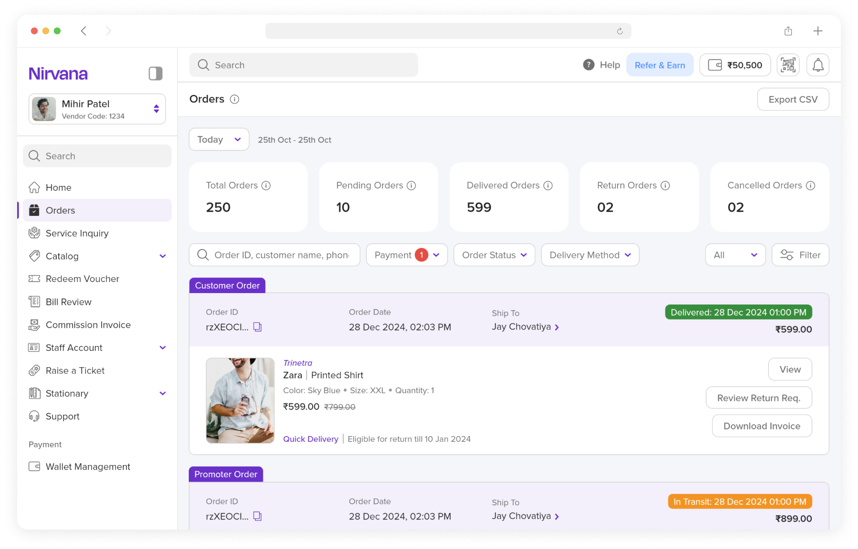
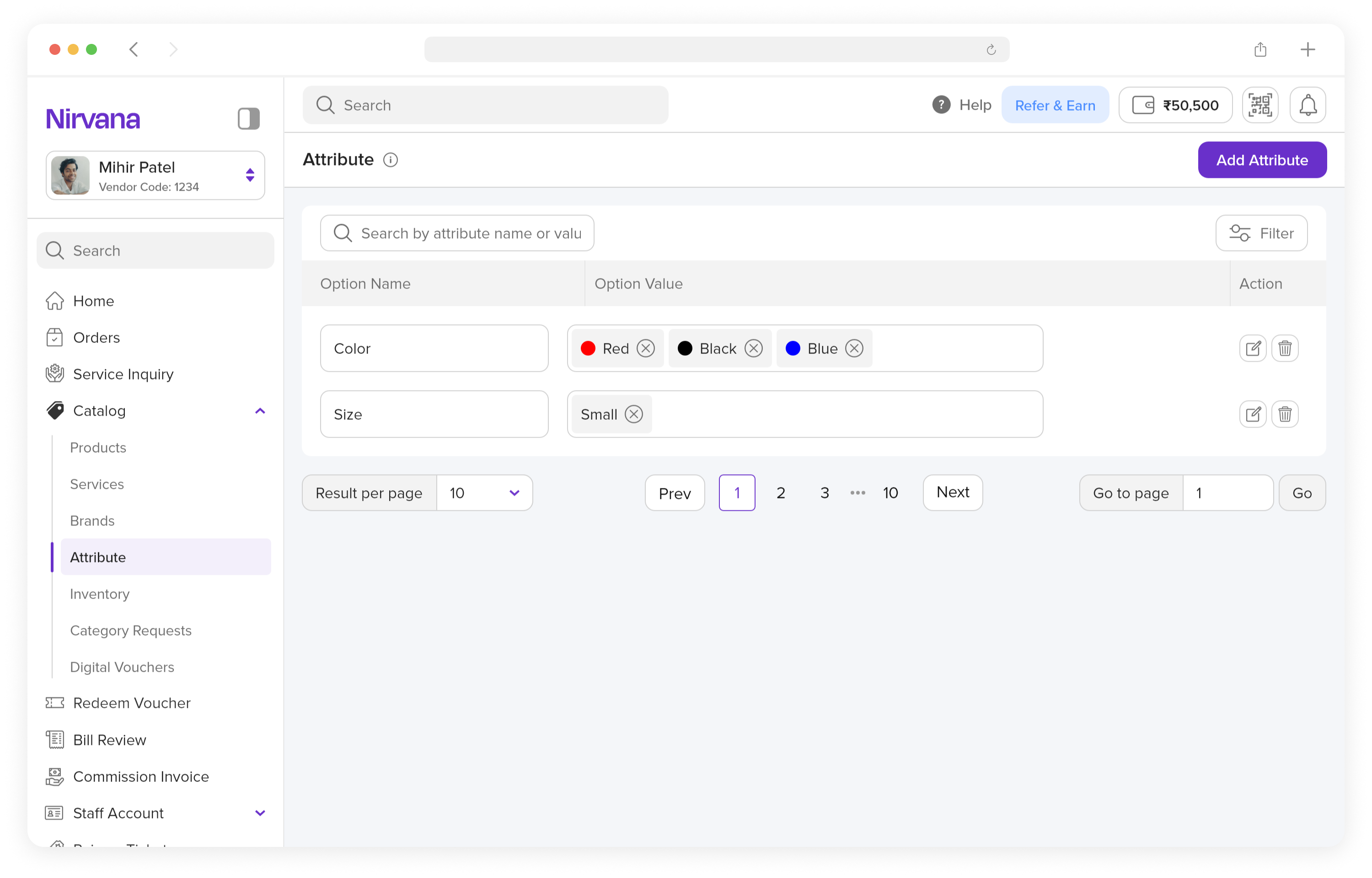
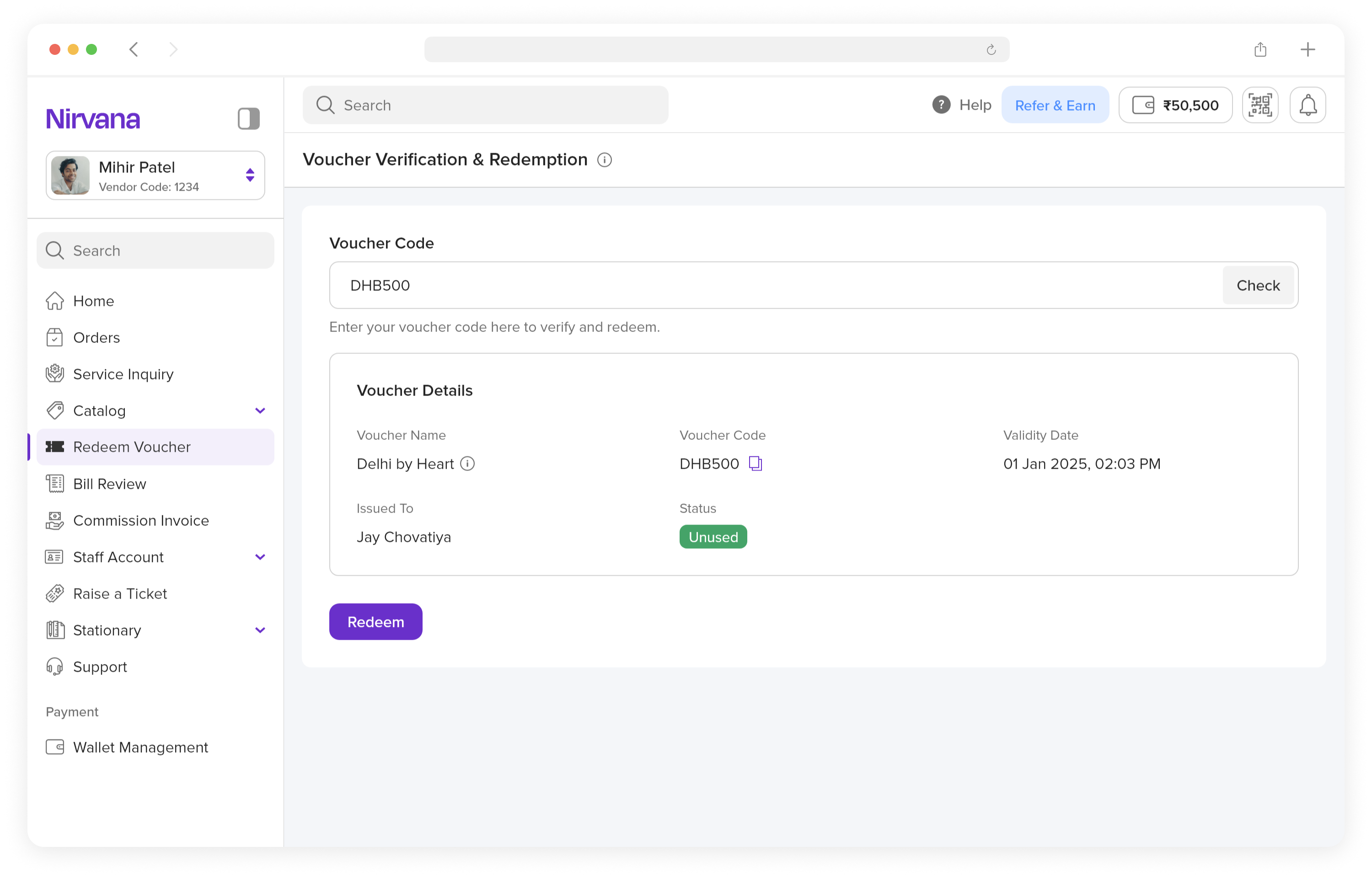
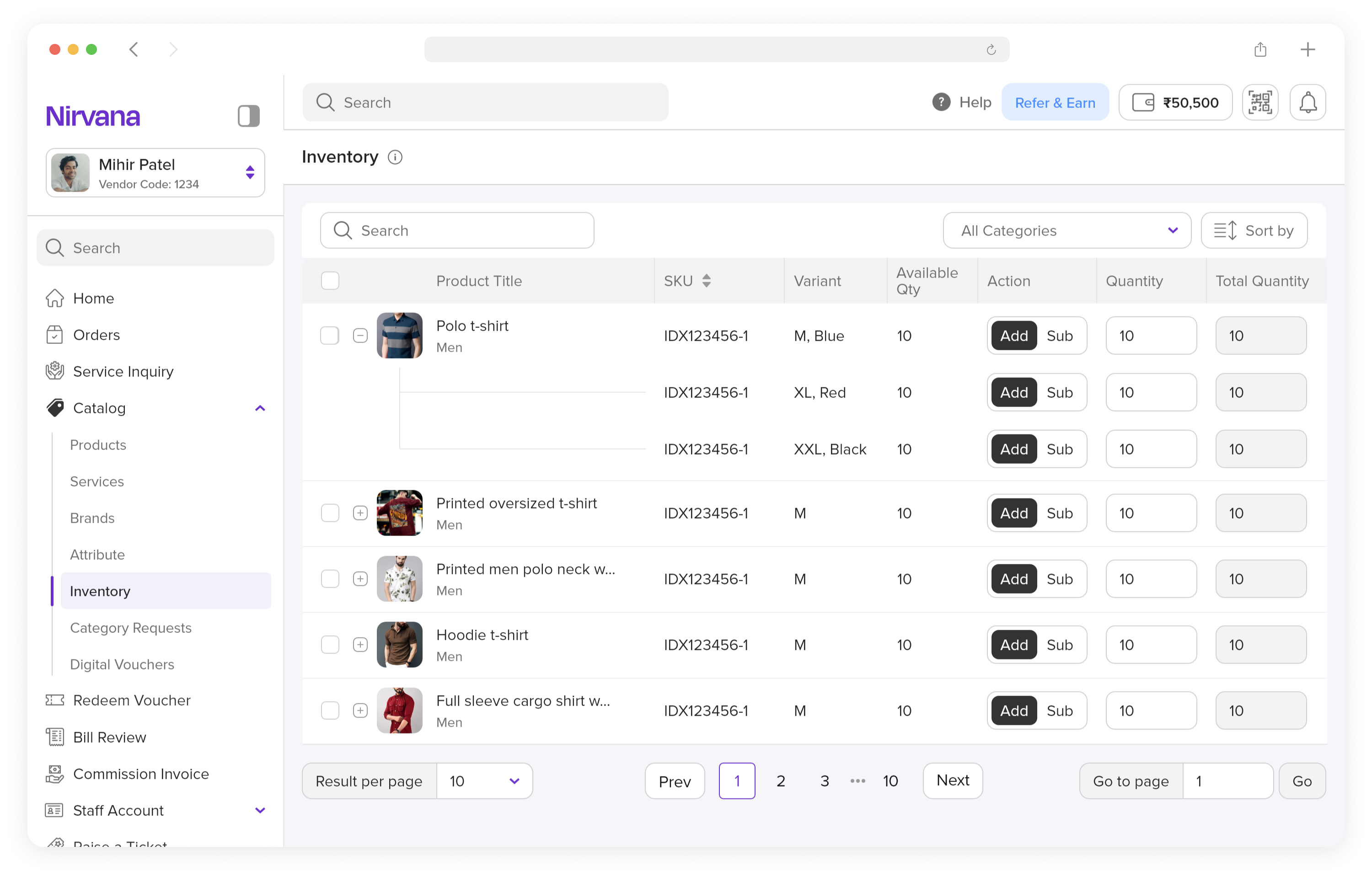
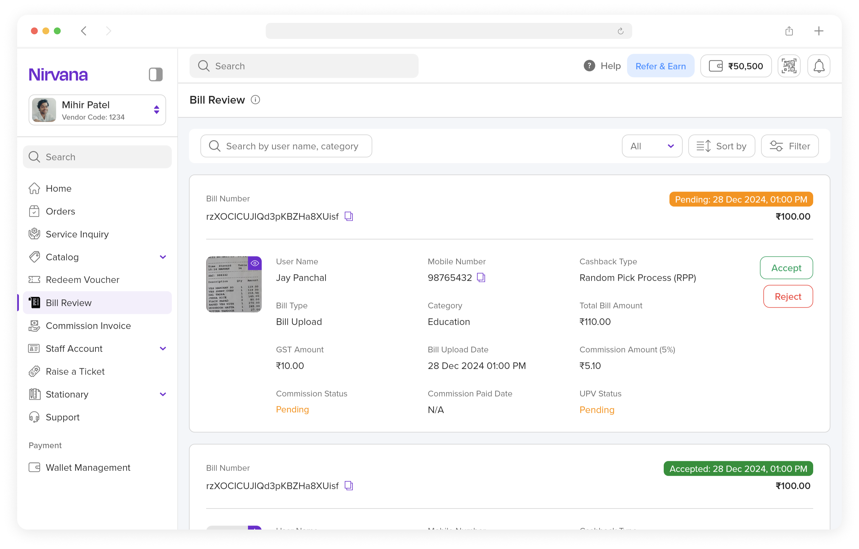
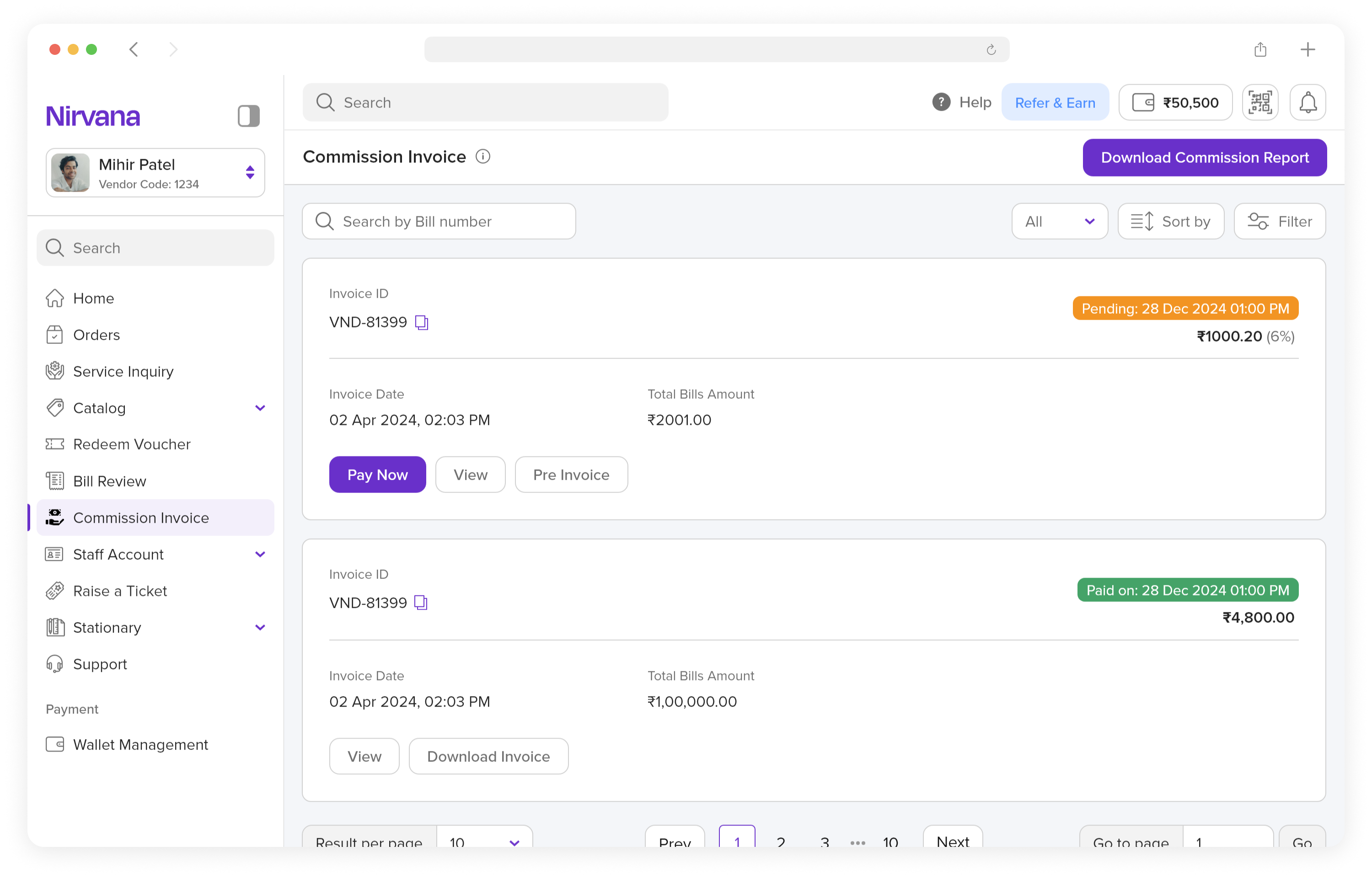
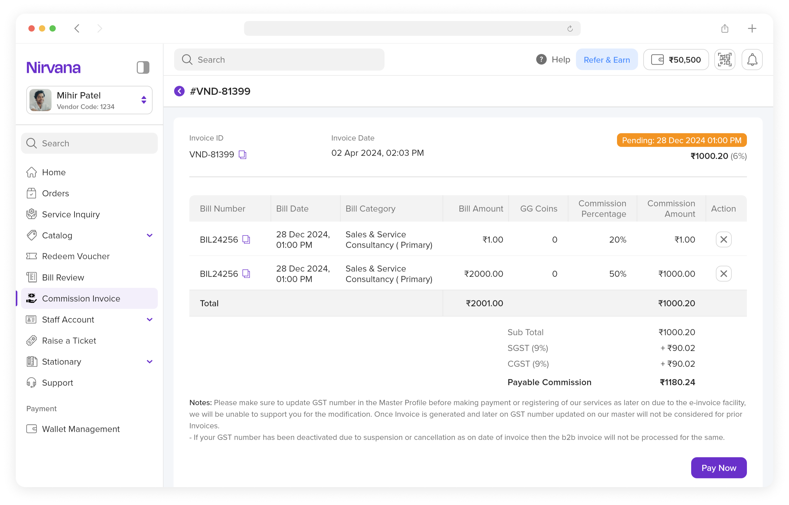
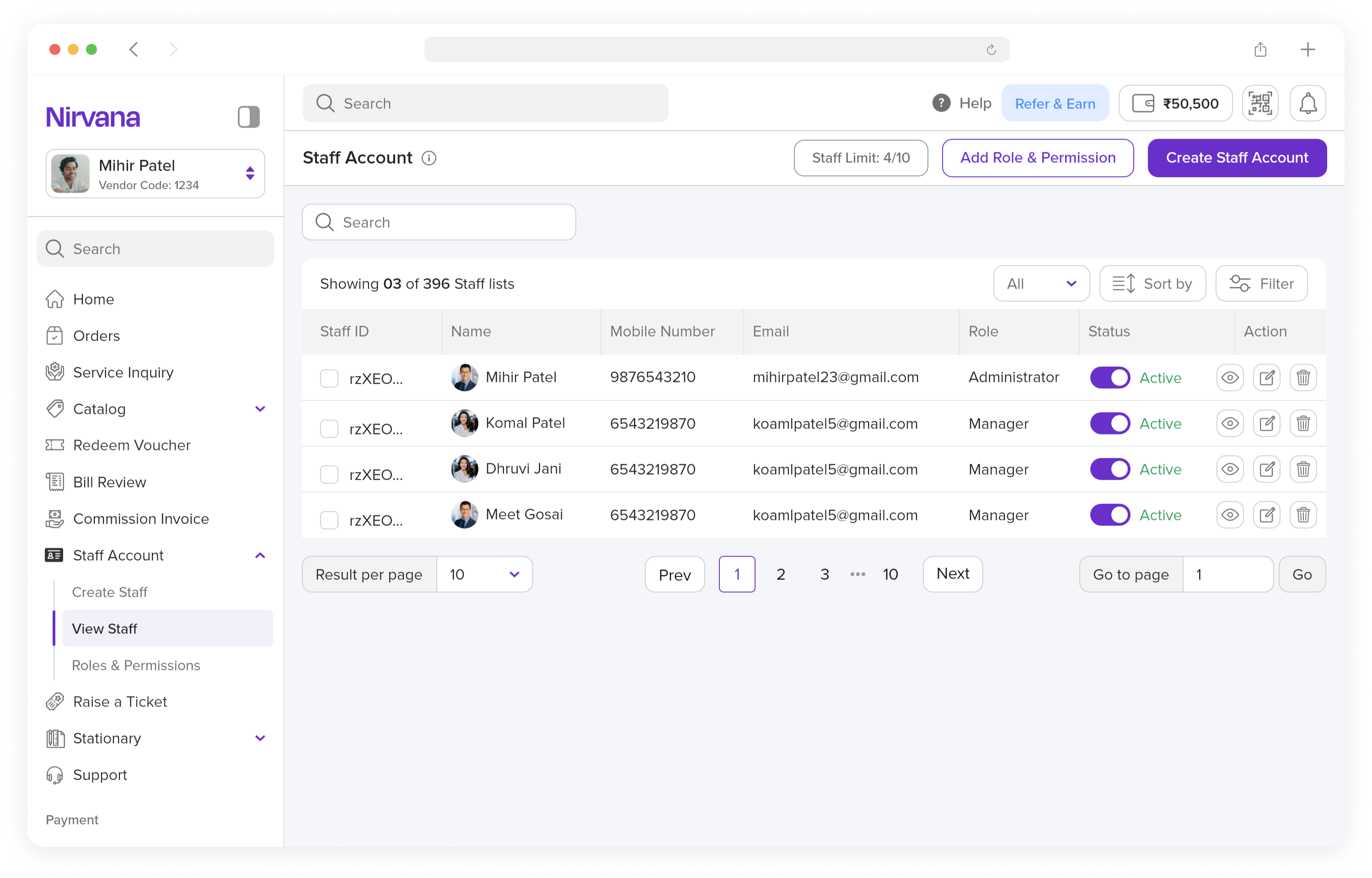
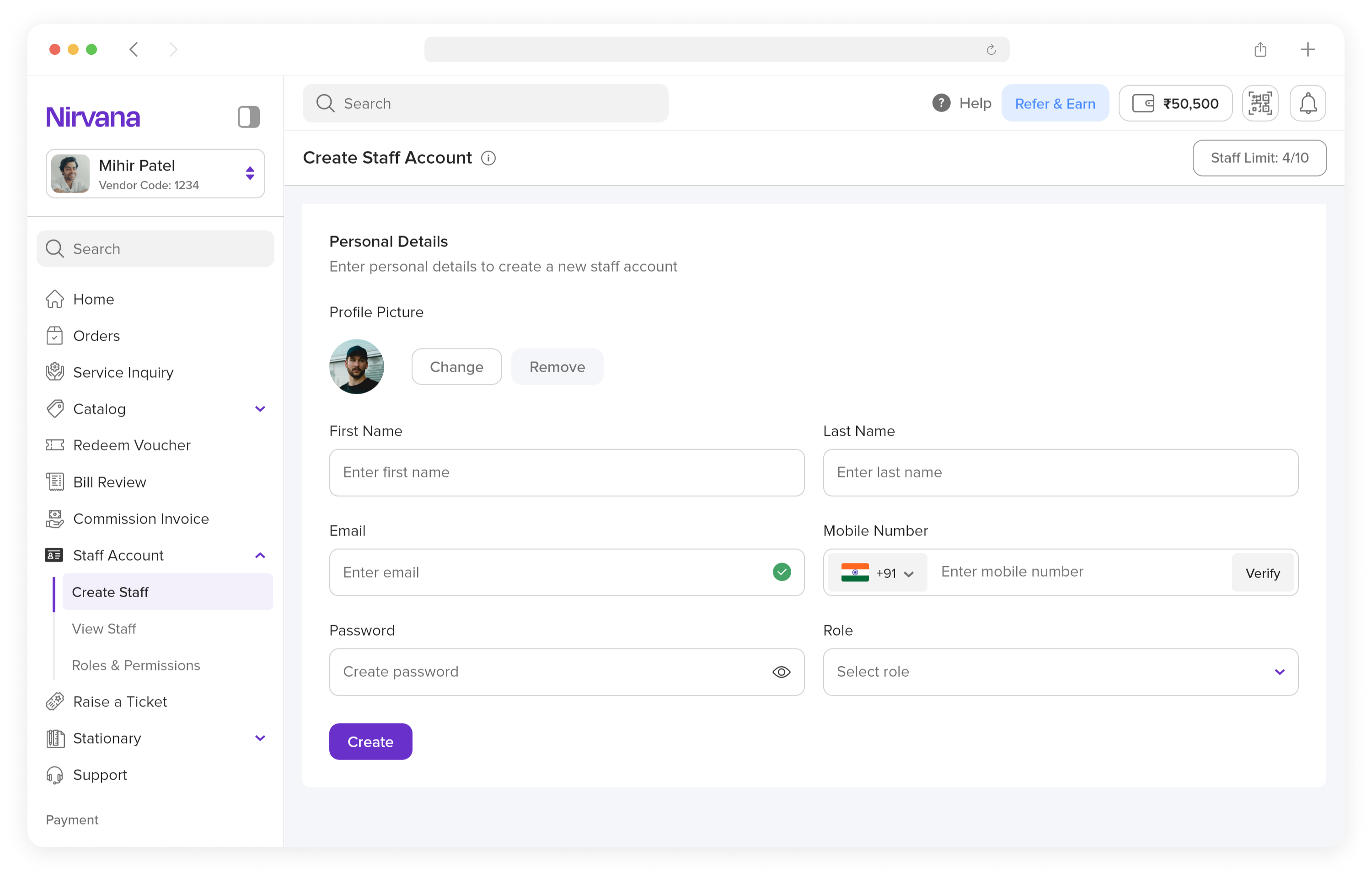
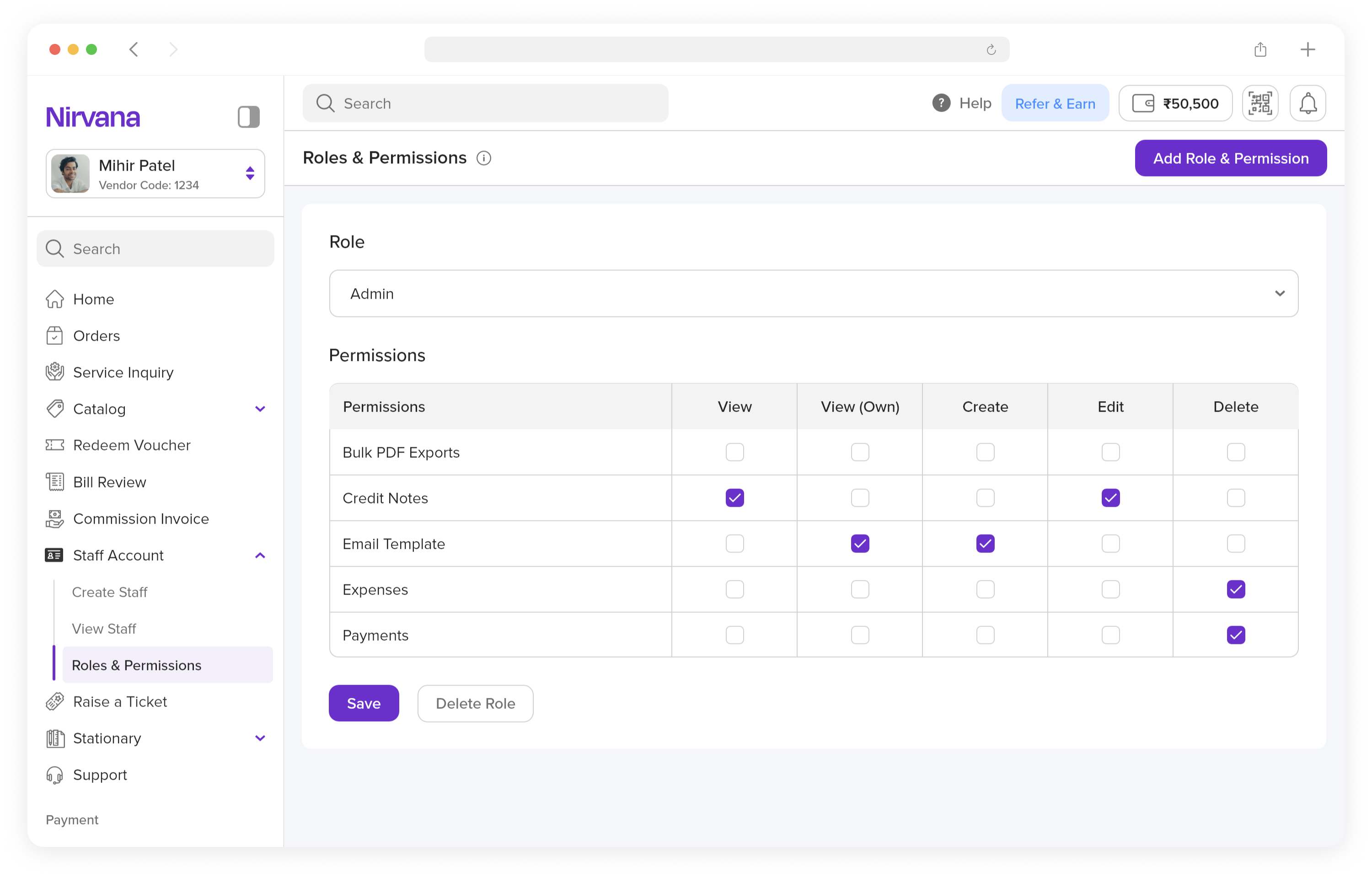
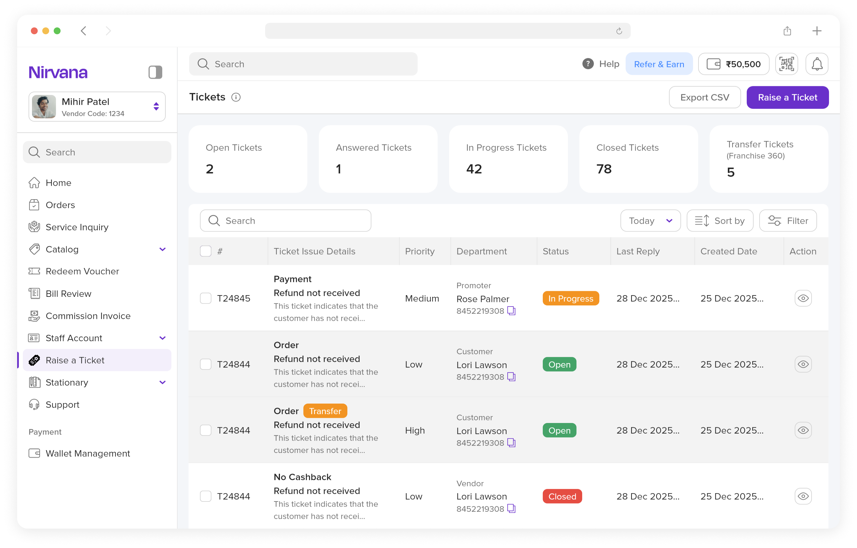
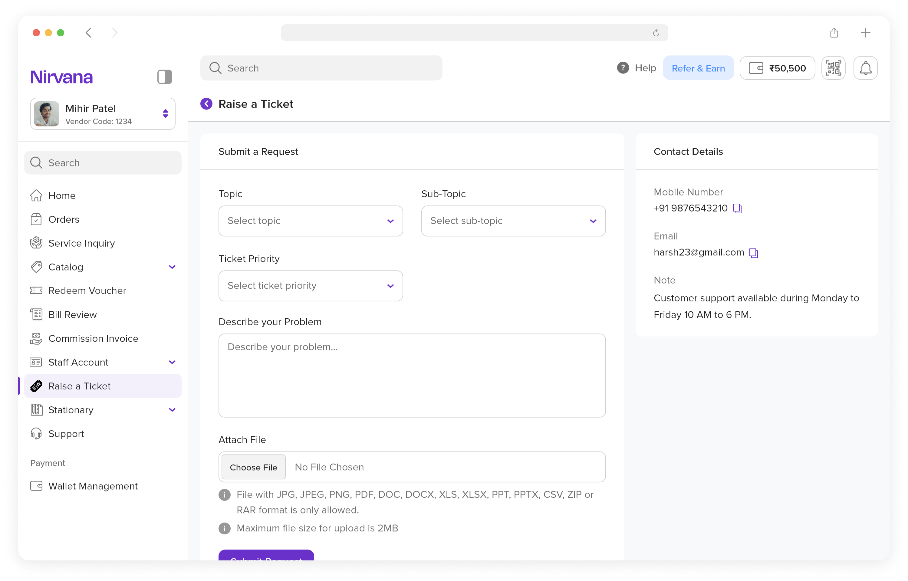
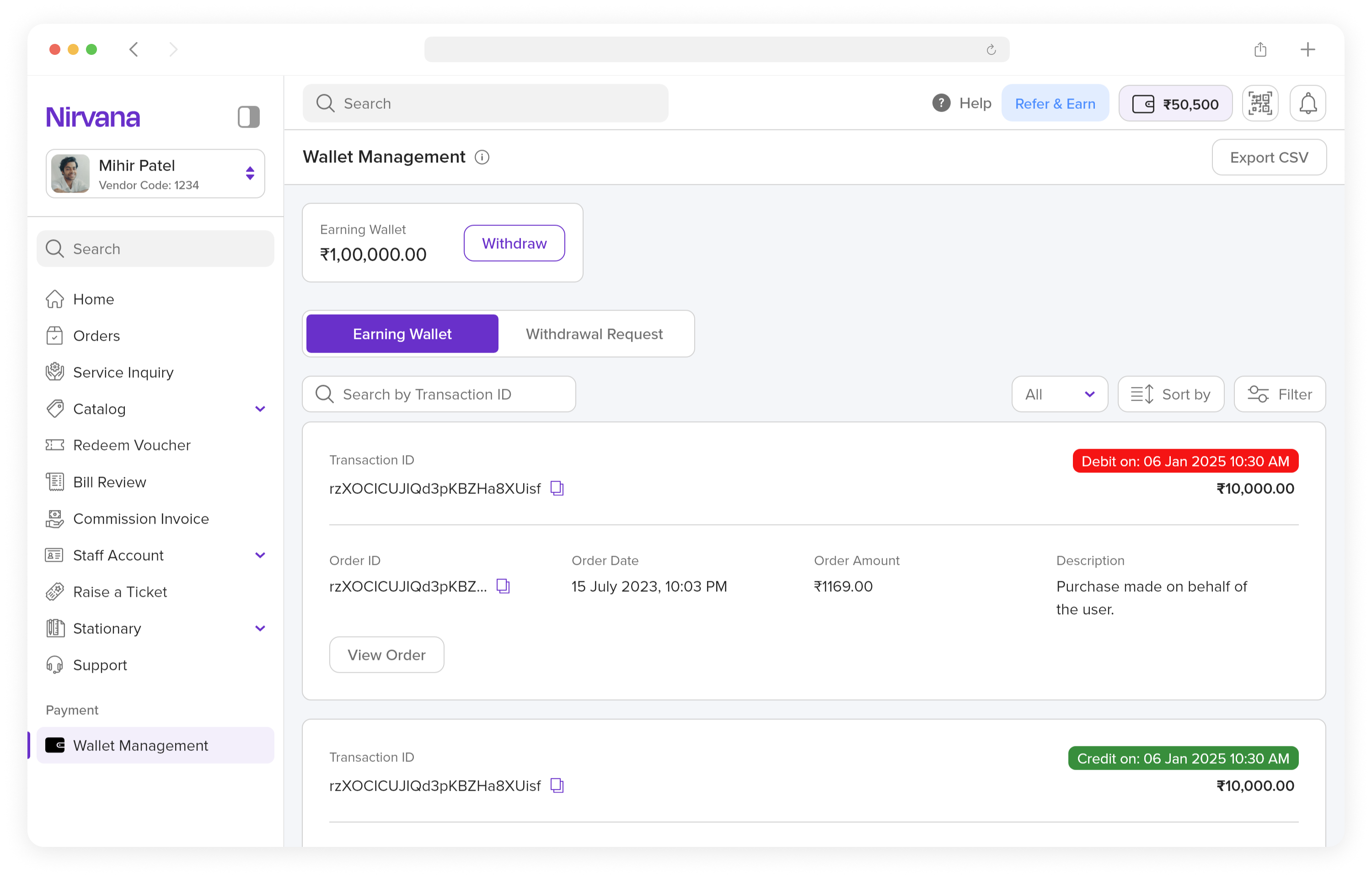
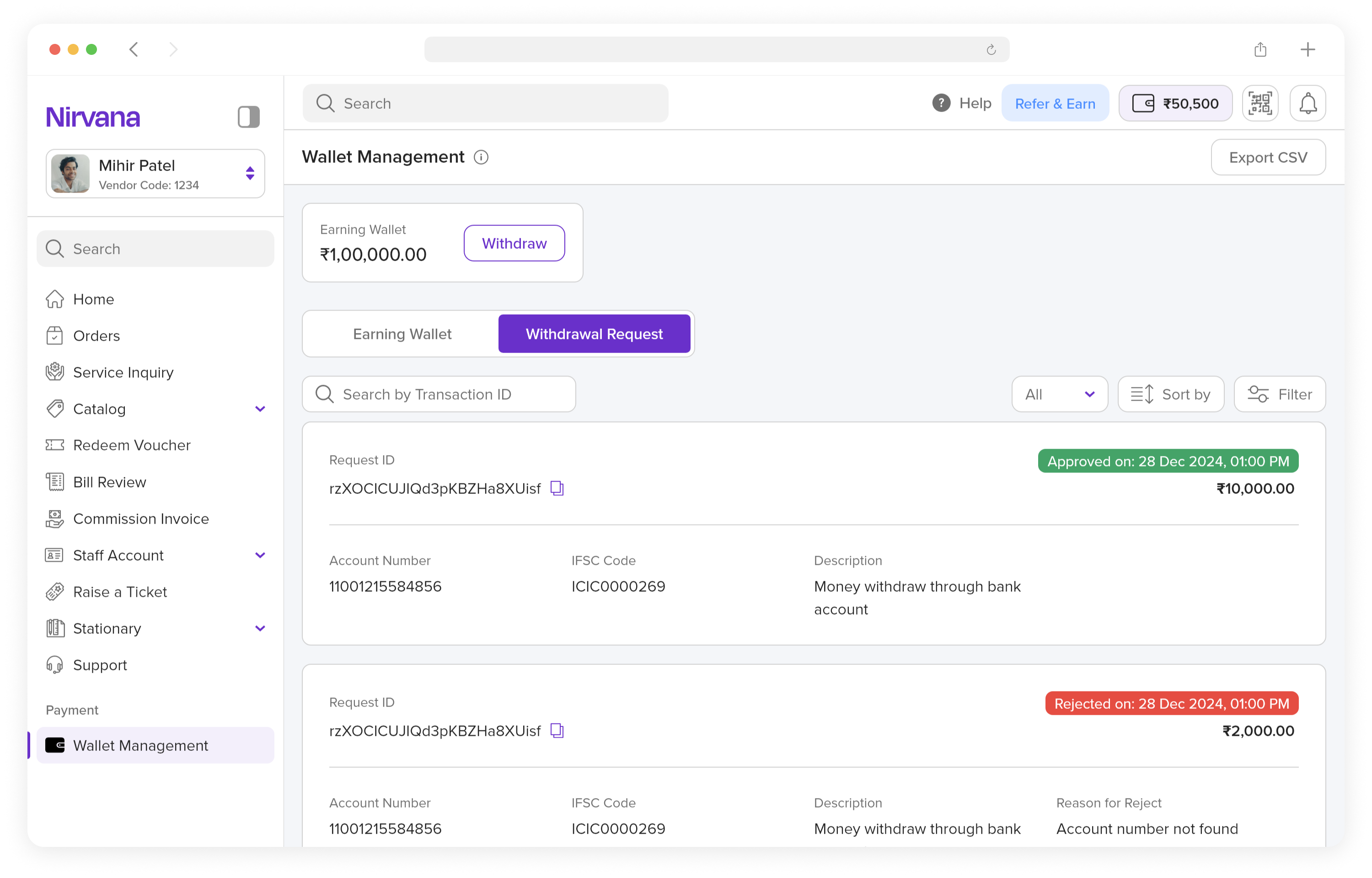
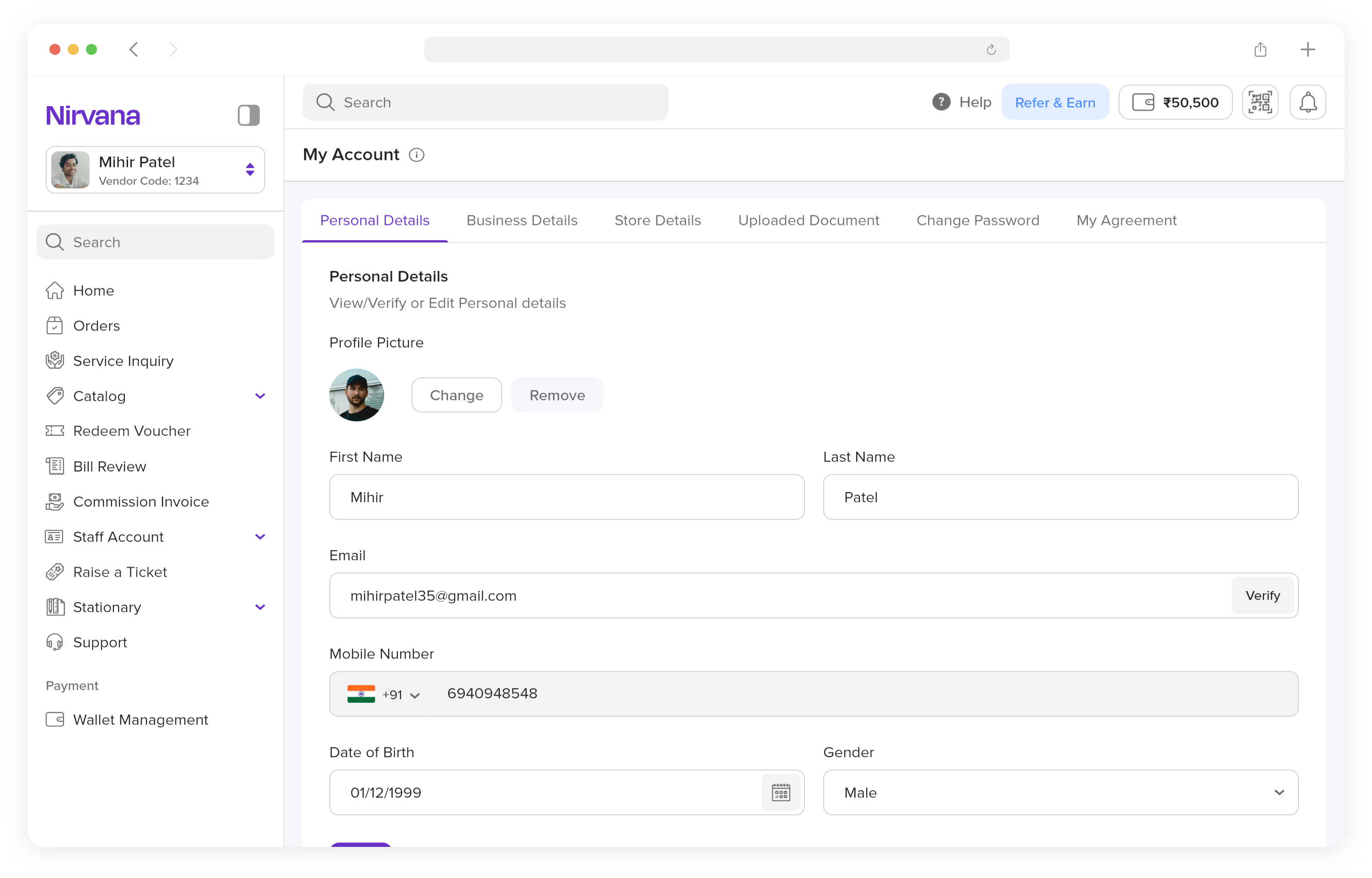
The redesign introduced a clean, card-based layout with improved spacing, typography, and visual hierarchy, enabling users to quickly scan information and focus on what matters most.
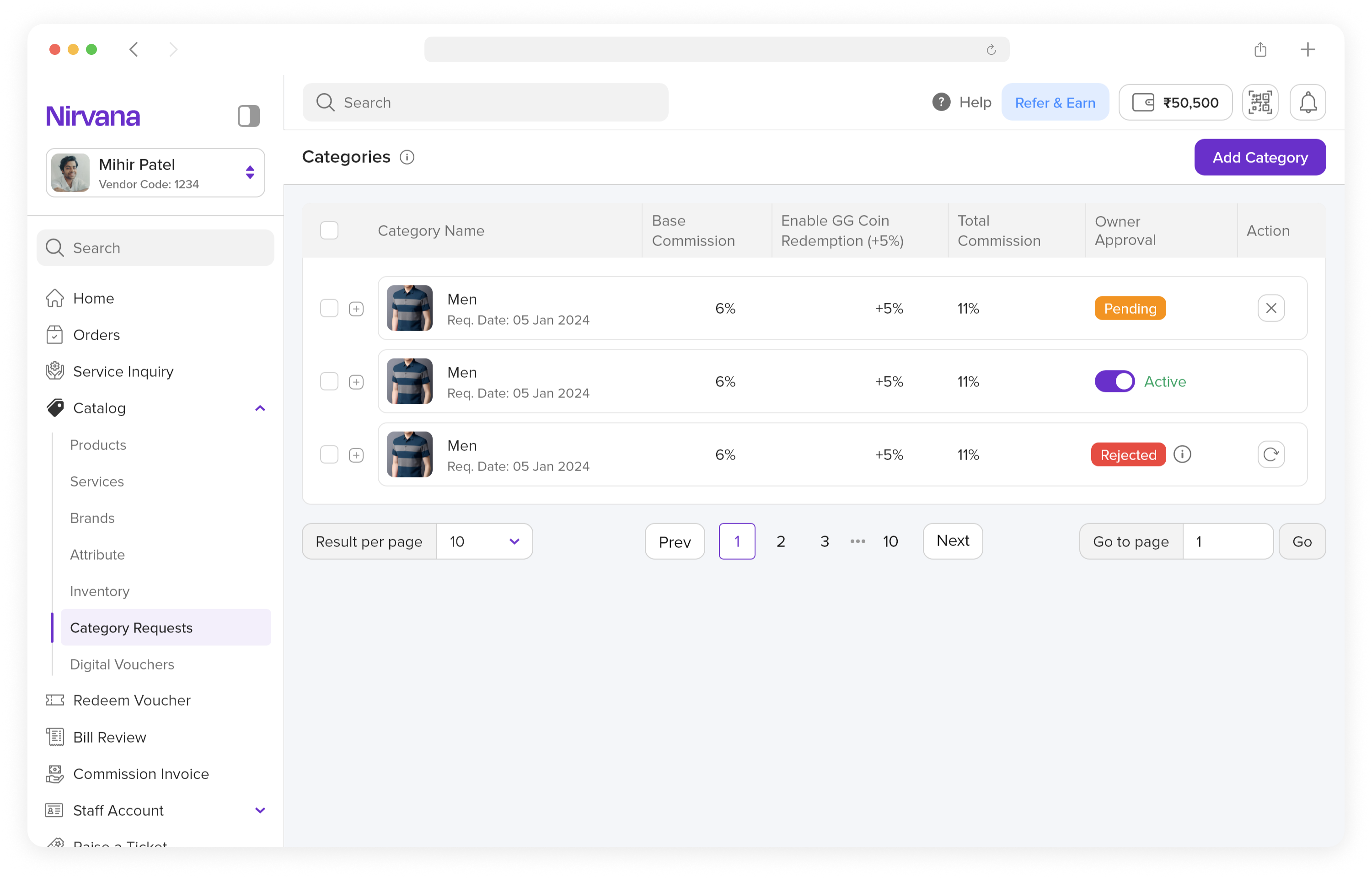
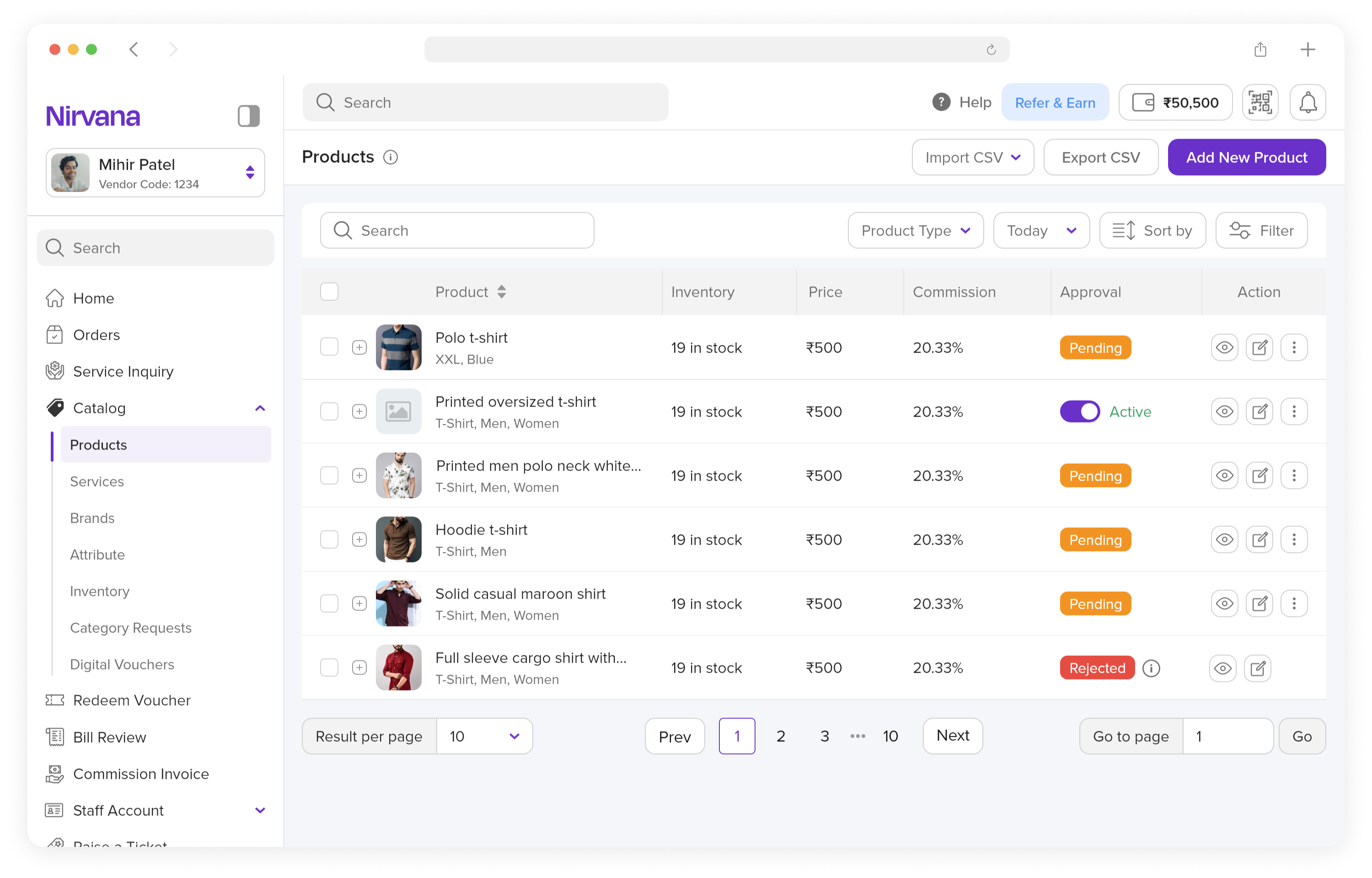
Navigation and interactions were streamlined using a structured sidebar, clear grouping of features, and actionable elements like filters and buttons, resulting in faster workflows and better usability.
 1.svg)